WATCH OUT we'll be famous at 60. Or so my fortune cookie tells me.
Bustin' out! I have work up at the Sycamore in San Francisco. They have the most amazing roast beef sandwich in the world, so says me.
And the best art.
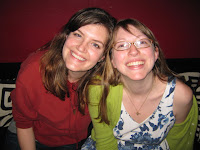
I haven't had proper photos taken yet, but here are some party pics!

My cousin Judy bought a piece, and took it off the wall! XOXO

uuuuuuuuuuuuuuuuuuuuuuuuuuuuuuuuuuuuuuuuuuuuuuuuuuuuuuuuuuuuuuuuuuu


AHHHH!! I just wrote out the best comment/critique/praise and it errored!!!!!!
ReplyDeleteOkay! let's try again.
ReplyDelete-The paper is great, subtle. Adding more could be good but not necessary.
-The intestines(?) are perfect. The graphic nature of them next to the black really makes the image look nestled in...like they're being exposed.
-Use of large color patches is new for you and I like how it is working.
-The little green arrow thing near the top and the wavy blue near the bottom are surprising and really pop against the red/blacks. nice.
With that said:
-Try adding areas of greater detailing and layered imagery (ala the mermaid painting) to bring parts of the painting forward and make other parts sink back.
-The bottom left corner by the foot needs work. At first I thought adding a lot of texture would be the ticket but I'm leaning more now towards extending the green...either way I want it to come out at me.
It's gonna be great, I applaud your laying it out with this painting...in the past even your scary/sad/troubling work were masked a bit without you talking about it.
To reiterate my main suggestion...use pockets of detail to add depth. :)
GAH! the first time I wrote this it was so much better!!